This one's relatively kinda brute-force, but it's the first one I coded so I'm keeping it around somewhere. The first letter of each hangul syllable must be capitalized for it to work. AGga would result in 아까, AgGa would result in 악가, agga would lead to disconnected text.
Compared to the newer version, this one is way clunkier internally. It's also kinda inconsistent about which etymological features are preserved and which aren't, and the way ye/hie is handled is weird because of bias from my own dialect. Not that the new one is perfect about all those things, but I hope it's a bit better.
Original Description:
I think I finally got this working but as usual if you find anything broken let me know. I wanted to use fun uncommon letters like Ҫ for Z/softC and Ҏ for RR, but this font didn't support them so I went for the (honestly more reasonable) Ц and РР instead. I wasn't sure what to do for initial Y since its pronounciation varies by dialect. It could've just been Й and technically been distinct, but Ж seemed closer to how a lot of people pronounce it so I went with that (I'm not being biased because I personally pronounce it more like Ш). Some words might be misinterpreted by the converter and would need to be added as 'exceptions' (eg. kilómetro > кило́метро > quilómetro). I'll try adding some, but if you find any I missed let me know through tumblr asks.
For the third pixel font, I just aimed to have a cap height of about 7 pixels tall, and to otherwise do whatever I thought looked good. I also tried to add support for more writing systems, and use the extra space to improve the legibility of the ones already present in the other fonts. While the prior fonts had a fixed width, this one has variable width, but generally uppercase letters tend to be 5x7 and lowercase letters tend to be 4x5, with most ascenders and descenders being two pixels tall. Diacritics can change shape and position depending on the letter which they are on.
Sevenish has enough extended latin to support Vietnamese, as well as some rough glitchy unfinished hangul (I do wanna finish it eventually, but that might take a while).Input pinyin, preferribly in all-lowercase or only with initial letters capitalized; ALL UPPERCASE text will not work correctly. If you have text in han characters you can get the pinyin version through goog translate. Bopomofo input WIP.
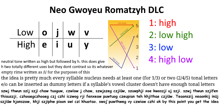
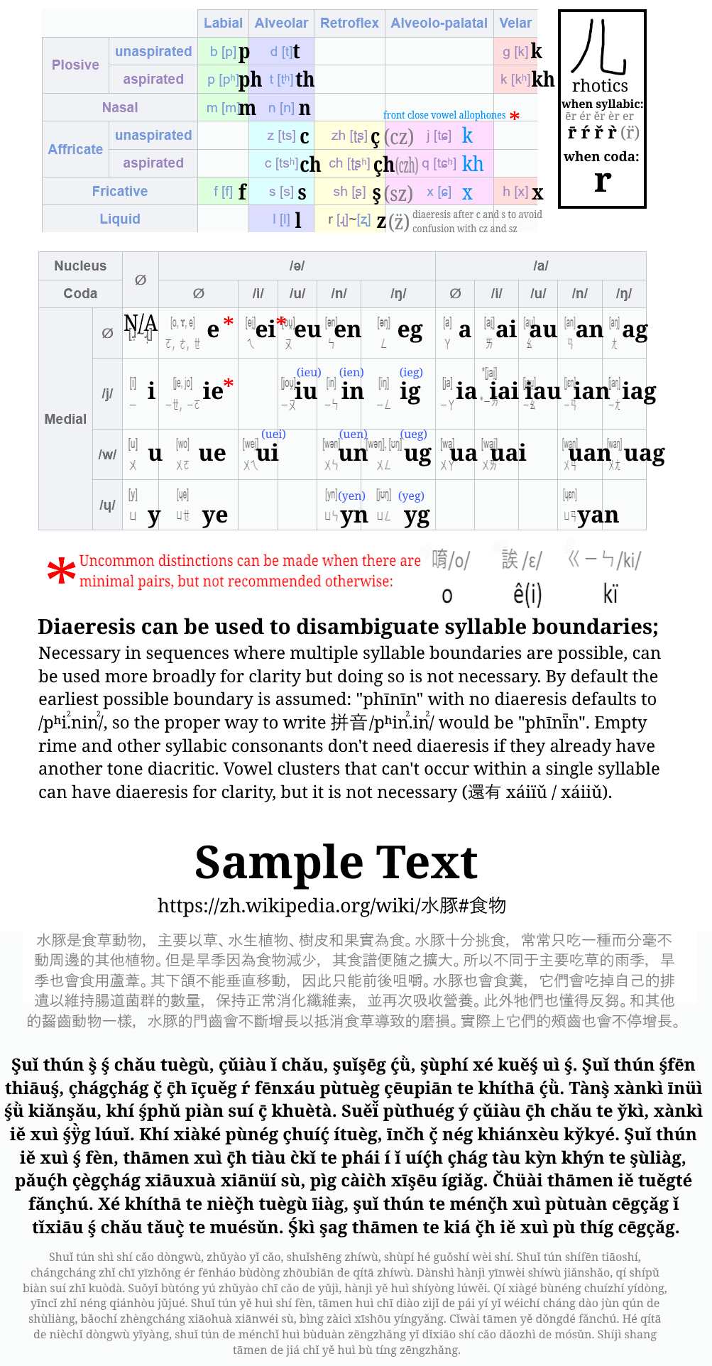
Honestly it's more like a relex of regular pinyin, but I don't know how to systematize getting pronounciation directly from hanzi so this'll have to do. I wanted to apply some stuff from the yale hangul romanization, like representing plain/aspirated pairs with h-digraphs for aspiration instead of with voiceless/voiced pairs. I also wanted to avoid using R for both retroflex /ʐ/ɻ/ and for rhotic vowel /ɚ/. Since the aspiration thing would require reworking how the rest of the retroflex consonants were done anyways, I decided to keep R for /ɚ/ and use Z for /ʐ/ɻ/, with a cedilla (which originally comes from an abbreviation of Z! fun fact) being used to represent retroflex consonants. So while working on that I also realized that much like in Korean and Japanese, /ɕ/ only happens in front of /j,i,ɥ,y/, a context in which /s/ does not occur, so /ɕ/ could be considered an allophone of /s/. So I decided to merge those two back into the same consonant, with the sequence represented by ZI/CI/SI in pinyin would instead be indicated by a different written vowel; eventually I decided on this being represented by the omission of a written vowel since on of the descriptions of that vowel sound I've seen is an elongation of the consonant sound, and also the only free vowel I had was O and that didn't look good in that context. So with all that /x/ was also represented by X, now that it wasn't being used by /ɕ/ and that H was being used for all sorts of aspiration-y stuff. Besides that I wanted to do final clusters in a sorta systemic way (even if it doesn't 100% match pronounciation), using the two-vowel analysis and at most one letter per portion of the cluster (3 at most for any cluster). The nuclei used for the two vowels are A and E, but E can be dropped if it's surrounded by both a medial and a coda. The medials are represented by I, U, and Ü (I wanted to use Y, but Ü seemed more intuitive since it's what pinyin already uses), which are written the same regardless of whether or not they are preceded by a consonant. The codas are represented by I, U, N, and Ṅ (I want to avoid the digraph NG, but Ṅ can be replaced with G or Q if dot diacritic cannot be easily typed). If a coda is followed by another medial in a way that creates ambiguity, the syllable boundary should be explicitly shown with punctuation such as a dash or an apostrophe (personally I like middle dots, but apparently they're sometimes used to mean neutral tone so I wanna avoid them here). I just used the same tone diacritics regular pinyin does. The priority of diacritic placement is: 1. On a nucleus vowel A/E. 2. On the final vowel in a cluster (e.g. uí, ún, iú) 3. On the first consonant of a syllable with no written vowel (e.g. ŕ, ś, ćh) [really this one just specifies "first" because I don't want tone diacritics on h]. There's also variants of which have either no diacritics or a ridiculous amount of diacritics. I wanna eventually add the options to input ㄅㄆㄇㄈ and to convert this back into regular pinyin, but that might take a while. EDIT 2023·03·10: Trying to make it so that instances of pinyin ZHI/CHI/SHI/RI also have the vowel omitted, for the sake of consistency with ZI/CI/SI. Might take a while to be fully implemented while trying to not break everything else.
Ref image.
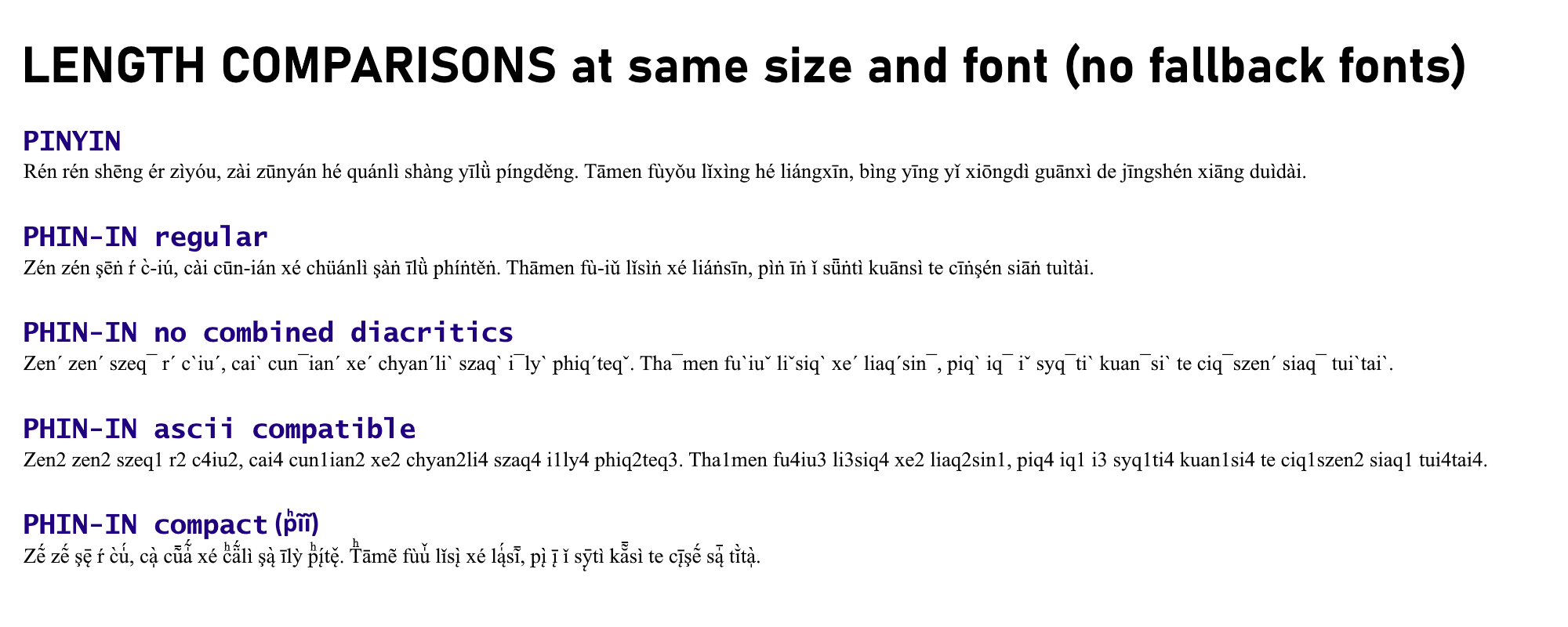
Length comparison.
Latin input assumes standard modern orthography; some words with historical or nonstandard spelling are accounted for, but others might have to be respelled phonemically. Since no common cyrillic keyboard layout has all letters used here, I've tried including some alternatives for typing: ЛЬ НЬ will be interpreted as Љ Њ, Э/ЙЕ will be interpreted as Є, ГХ will be interpreted as Ӷ, Щ will be interpreted as Ў (although you could probably just use У and it'd be fine).
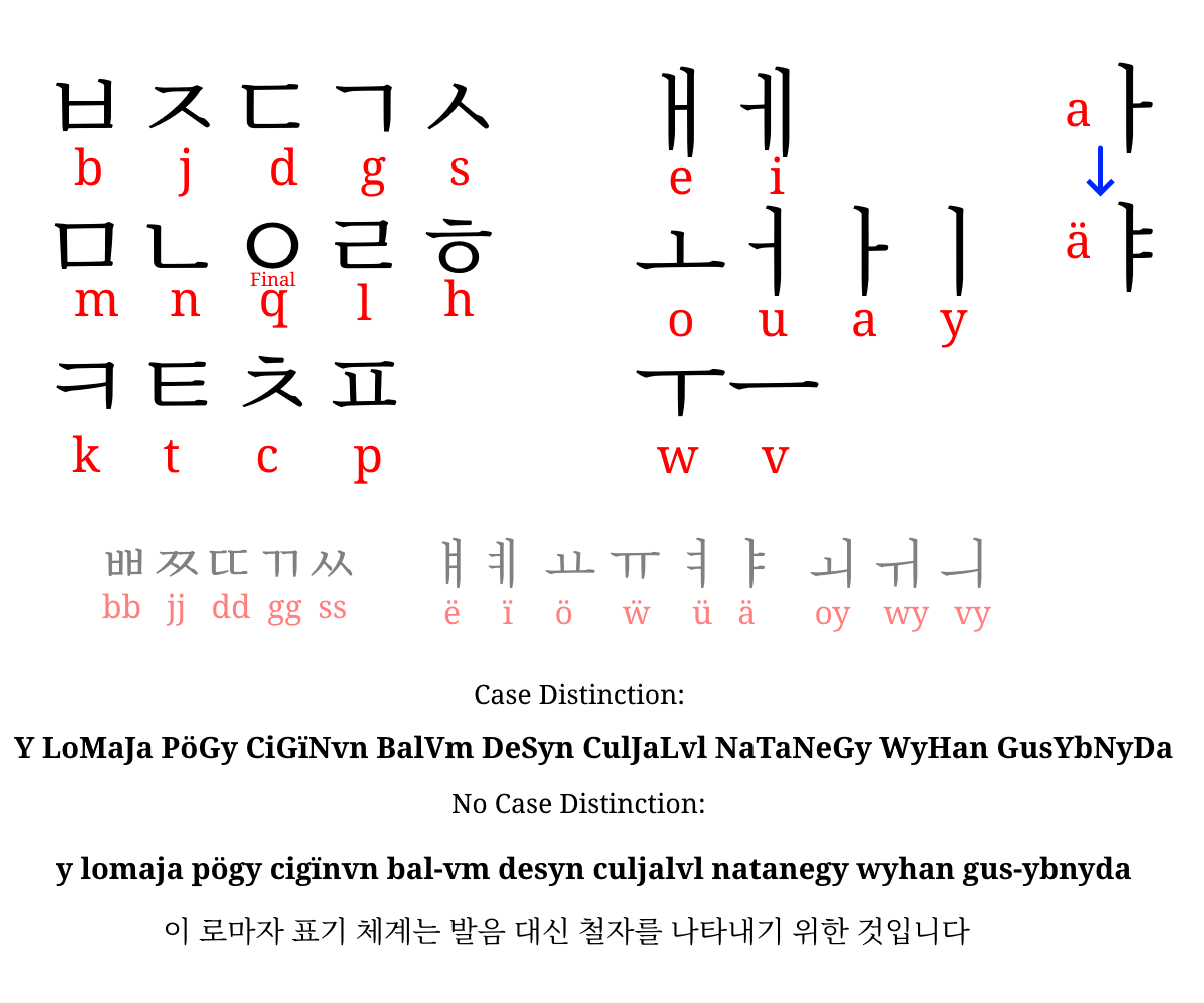
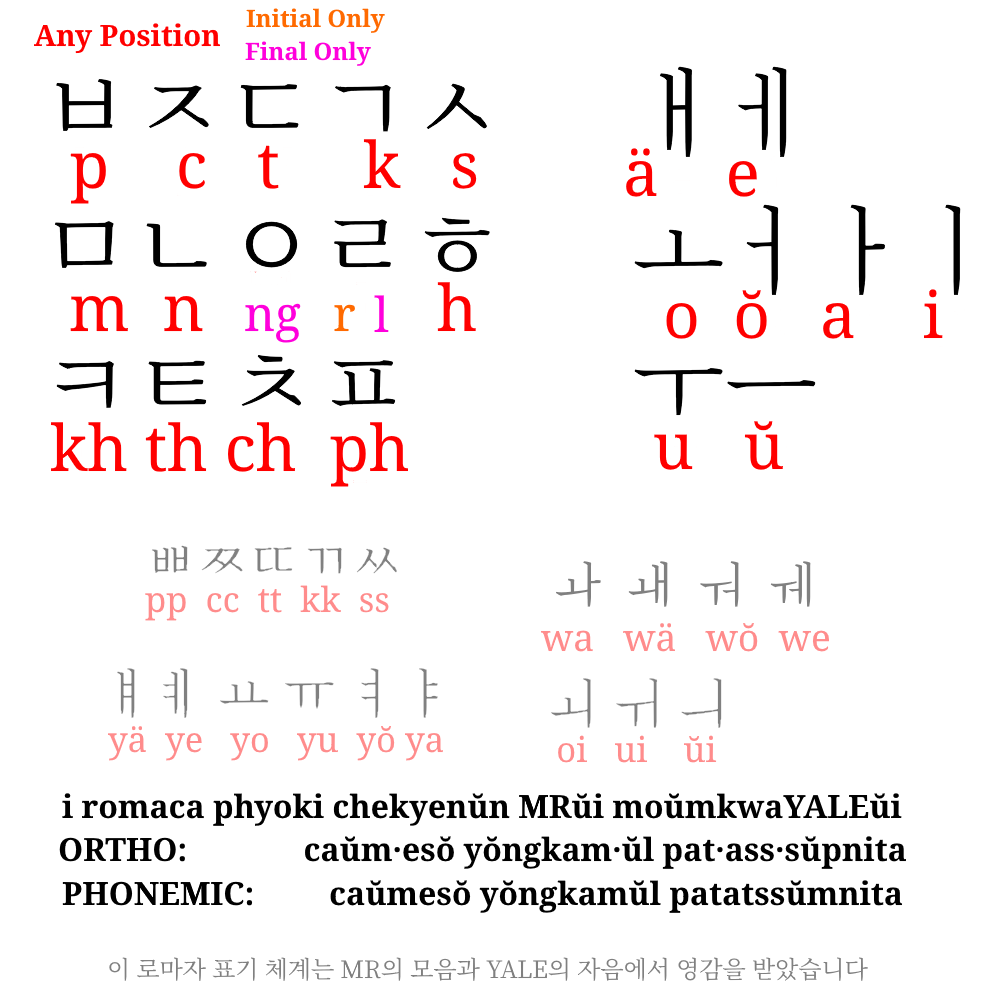
There are many well-thought out systems for romanizing the Korean language into the Latin alphabet. This is not one of them. I started off making a joke romanization scheme based off the aesthetics of conlangs Iqglic and VötGil, but a Korean speaking friend said it was actually decent so that inspired me to refine it into a still-silly but actually kinda usable system. Its goal would be to represent each jamo with a single Latin letter, regardless of pronounciation. Some of it is similar to existing romanization systems, so I'll try describing ways in which it differs from some of them: Letters v, w, y are used to represent vowels. Diacritic ¨ on a vowel represents the doubling of the short line, and vowel sequences within a syllable are represented by the wide vowel's letter followed by the tall vowel's letter. Most consonants are written the same regardless of position; the main exception is ㅇ being unwritten syllable-initially and represented as letter q when syllable-finally (this is the main iqglic leftover). There are two methods for disambiguating syllable boundaries when needed, one with punctuation and another with case distinction. The case system just represents the initial letter of a syllable as uppercase; I don't like the case system much because it feels excessive and seems like a pain to type, but it was the easiest for me to code so that's the first one I coded. I prefer the punctuation method which would use a mark such as ' or - to disambiguate syllable boundaries, ideally in an optional way only used when necessary. The internal logic for this one is more complicated but I think I got it working decently well. Converter box made with a lot of help from wrn. If you find a way in which this is broken feel free to send me an ask on Tumblr and I'll try to fix it or cry if I don't know how to.
Saucy Style reference image.
It's called S2E because it wasn't my idea. Shoutouts 2 Echo. It mostly combines how Yale romanization represents consonants (voiceless letters for plain stops, h-digraphs for equivalent aspirated stops) with how McCuneReischauer does vowels. It doesn't follow either of them exactly; ㅐ is replaced with "ä", and 외 위 의 are represented with digraphs of their initial vowel and i (oi ui ŭi). There are two versions; one is more "orthographic", most of it is 1-to-1 with Hangul orthography and not pronounciation, with the few exceptions still being predictably transcribeable to hangul (ㄹ is written as 'r' when syllable initially and not preceded by ㄹ, and as l in all other instances; in ㅘㅙㅝㅞ both ㅗ and ㅜ are written as 'w', since they do not contrast with each other). The other tries to account for consonant assimilation and the pronounciation of syllable-final consonants. Again Shoutouts 2 Echo for helping out because they understand this way better than I do. Apparently consonants assimilate differently in verb endings and grammatical particles (e.g. ᄋᆞᆺᄋᆞ becomes ᄋᆞᄉᆞ) compared to other contexts such as compound words (e.g. ᄋᆞᆺᄋᆞ becomes ᄋᆞᆮᄋᆞ becomes ᄋᆞᄃᆞ). This whole thing is kinda finnicky so if you find anything that seems to not be working like it seems it should, let me know through a tumblr ask. Besides that, it doesn't use as many middle dots for distinguishing mid-word final consonants followed by vowels. Middle dots only really show up to distinguish vowel glide digraphs vs sequences, (e.g. 와=oa 오아=o·a). As of the latest update, w-diphthongs default to w instead of o/u when they don't contrast
S2E reference image.
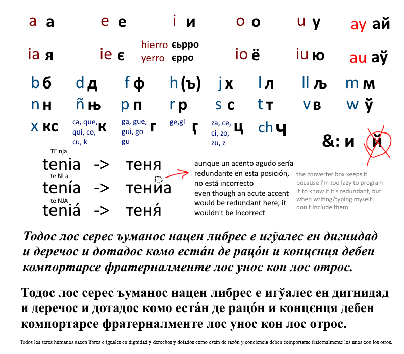
Initially I wanted to just make it be based on phonology, maintaining orthographical distinctions that exist in any dialect that I know of such as that between Z and S or Y and LL. However, I eventually decided to also include distinctions such as that between B/V, which are rarely if ever phonemic. In the latest version, the way silent H is handled depends on context. When it is purely etymological, it is represented by the letter Ъ. As part of semivowel digraphs such as HUE or HIE it is not directly written, instead those are represented by the same sequence that would represent them after another consonant (/w/ is always Ў, /j/ is more complicated but not for the reason you might think. For many people, this phoneme would commonly be written as usually Y but sometimes HI when it's syllable initial and I when it's after another consonant. But in rioplatense spanish, Y and HI are pronounced quite differently, with Y being more different than the other two. But since out of all of these HI is the less common one, pretty much just showing up at the beginning of a few words, I thought it'd be better to have Y and I be represented by Я Є Ё Ю, while the less-frequent HI is kept distinct in a phonemic-ish way by the addition of a subsequent soft sign, ЯЬ ЄЬ ЁЬ ЮЬ. That was a long parentheses section sorry). Z and soft C are both Ц, since for the majority of contexts the spelling is entirely predictable by the following vowel; initially I wanted to handle J and soft G similarly, but there are too many words where the one used cannot be predicted through phonemic context, so they are Х and Ӷ respectively (if for some reason you wanted to specify the sequences ZE and ZI, З is unused so you could go for that). Anyways, more details in the image below (coming soon), try it out at the same page the other text stuff is at. If anything seems off about it feel free to send me an ask.
Ref image.
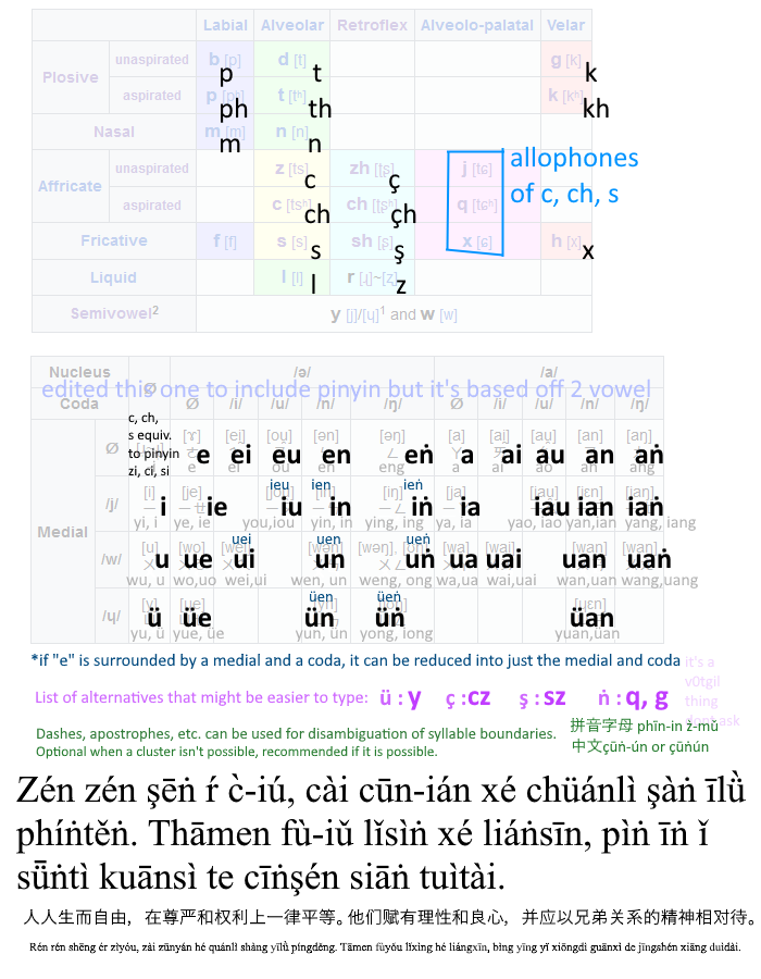
Honestly it's more like a relex of regular pinyin, but I don't know how to systematize getting pronounciation directly from hanzi so this'll have to do. I wanted to apply some stuff from the yale hangul romanization, like representing plain/aspirated pairs with h-digraphs for aspiration instead of with voiceless/voiced pairs. I also wanted to avoid using R for both retroflex /ʐ/ɻ/ and for rhotic vowel /ɚ/. Since the aspiration thing would require reworking how the rest of the retroflex consonants were done anyways, I decided to keep R for /ɚ/ and use Z for /ʐ ɻ/, with a cedilla (which originally comes from an abbreviation of Z! fun fact) being used to represent retroflex consonants. So while working on that I had the thought that since /tɕ tɕʰ ɕ/ only happen before close front (semi)vowels /i y j ɥ/, a context where velar /k kʰ x/ rarely ever happen, they are still in complimentary distribution, so they can be considered close-front-vowel allophones of the velars; admittedly I didn't realize this until someone else pointed it out to me (shoutouts to oockap) and initially I made these allophones of /ts tsʰ s/ which in retrospect wasn't a great idea, but that prior context is why empty rimes are often spelled without a vowel; they could be considered in complimentary distribution with /i/ and I might sometimes spell it as such when I can't put tone diacritics on consonants, but I kinda like the look of vowelless empty rime so that's why I kept it. Besides that I wanted to do vowel+coda clusters in a sorta systemic way (even if it doesn't 100% match phonemic realization), using the two-vowel analysis and at most one letter per portion of the cluster (3 at most for any cluster). The nuclei used for the two vowels are A [a~ɛ] and E [e~ɤ~o], but E can be dropped if it's surrounded by both a medial and a coda. The medials are represented by I /i~j/, U /u~w/, and Y /y~ɥ/. The codas are represented by I /j/, U /w/, N /n/, and G /ŋ/. If a coda I/U/N isn't separated from the next syllable nucleus by an unambiguous initial consonant, diaeresis can be placed on the first component of the second syllable for disambiguation (e.g. 意念 inian vs 引言 inïan). For tones I just used the same diacritics regular pinyin does. The priority of diacritic placement is: 1. On a nucleus vowel A/E. 2. On the final vowel in a cluster (e.g. uí, ún, iú) 3. On the first consonant of a syllable with no written vowel (e.g. ŕ, ś, ćh). There's also a diacriticless version of this which is fine for the consonants but really bad for tones; I would not recommend using NGR tones, if you can't use diacritics just use numbers or something.
Ref image.
Diacriticless Tones (Bad)