Back Home

Projects

This is where I talk about stuff I'm trying to do because I find it interesting.

Subpages:


Other Pixel Fonts

Since this section was written I've made a lot of progress with Sevenish, but I don't want to rewrite it until changes become less frequent. I post occasional updates on my tumblr page.

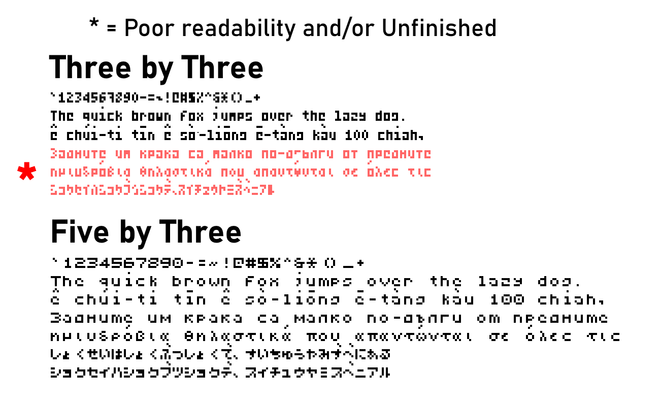
For the first two pixel fonts I made, I set intentional restraints/limitations of a fictional computer system. Not including the one pixel of spacing between all letters, the first has 3x5 letter bodies, and the second has 5x5 letter bodies. I tried to maintain case distinction whenever possible; generally uppercase letters are 5 pixels tall while lowercase letters are 4 pixels tall, but lowercase letters with ascenders can be 5 pixels tall. Initially I'd made diacritics ignore these limitations, but then I decided to give them their own rules; diacritics can occupy a two-pixel tall space above or below the letter body (again with one pixel of separation). There is only one diacritic row between lines, so a limitation of this system would be that a letter with a lower diacritic (like ç) cannot be directly above a letter with an upper diacritic. In lowercase i and j the tittle always goes in the diacritic slot, so that it can be replaced by diacritics (or removed in the case of dotless ı).

All fonts support some extended Latin. 5x5 additionally supports Cyrillic, Greek, Hiragana & Katakana. 3x5 has some experimental attempts at Cyrillic, Greek, Katakana, and linear Hangul, but the resolution is too low for them to be legible.

Here are links to download the fonts. The only condition is don't use them for shit that supports corporations or governments or conservative stuff. I don't know why any of those would wanna use a fucking pixel font, but there's a military esports team so better safe than sorry. I mean if you've made it this far into my website, you can probably guess my politics. They're not copyrighted or anything, I'd appreciate it if you gave me credit on stuff you use it for but I'm not gonna be pissed off about it if you don't. Probably I'm not even gonna find out about it.


The sections below explain different kinds of transliteration methods. To try them out in an automated way, click here.

To view the images at a higher resolution, open them in a new tab.


Hangul Romanizations

Saucy Style romanization (Silly)

There are many well-thought out systems for romanizing the Korean language into the Latin alphabet. This is not one of them. I started off making a joke romanization scheme based off the aesthetics of conlangs Iqglic and VötGil, but a Korean speaking friend said it was actually decent so that inspired me to refine it into a still-silly but actually kinda usable system. Its goal would be to represent each jamo with a single Latin letter, regardless of pronounciation. Some of it is similar to existing romanization systems, so I'll try describing ways in which it differs from some of them: Letters v, w, y are used to represent vowels. Diacritic ¨ on a vowel represents the doubling of the short line, and vowel sequences within a syllable are represented by the wide vowel's letter followed by the tall vowel's letter. Most consonants are written the same regardless of position; the main exception is ㅇ being unwritten syllable-initially and represented as letter q when syllable-finally (this is the main iqglic leftover). There are two methods for disambiguating syllable boundaries when needed, one with punctuation and another with case distinction. The case system just represents the initial letter of a syllable as uppercase; I don't like the case system much because it feels excessive and seems like a pain to type, but it was the easiest for me to code so that's the first one I coded. I prefer the punctuation method which would use a mark such as ' or - to disambiguate syllable boundaries, ideally in an optional way only used when necessary. The internal logic for this one is more complicated but I think I got it working decently well. Converter box made with a lot of help from wrn. If you find a way in which this is broken feel free to send me an ask on Tumblr and I'll try to fix it or cry if I don't know how to.

Saucy Style reference image.


S2E romanization (Epic)

It's called S2E because it wasn't my idea. Shoutouts 2 Echo. It mostly combines how Yale romanization represents consonants (voiceless letters for plain stops, h-digraphs for equivalent aspirated stops) with how McCuneReischauer does vowels. It doesn't follow either of them exactly; ㅐ is replaced with "ä", and 외 위 의 are represented with digraphs of their initial vowel and i (oi ui ŭi). There are two versions; one is more "orthographic", most of it is 1-to-1 with Hangul orthography and not pronounciation, with the few exceptions still being predictably transcribeable to hangul (ㄹ is written as 'r' when syllable initially and not preceded by ㄹ, and as l in all other instances; in ㅘㅙㅝㅞ both ㅗ and ㅜ are written as 'w', since they do not contrast with each other). The other tries to account for consonant assimilation and the pronounciation of syllable-final consonants. Again Shoutouts 2 Echo for helping out because they understand this way better than I do. Apparently consonants assimilate differently in verb endings and grammatical particles (e.g. ᄋᆞᆺᄋᆞ becomes ᄋᆞᄉᆞ) compared to other contexts such as compound words (e.g. ᄋᆞᆺᄋᆞ becomes ᄋᆞᆮᄋᆞ becomes ᄋᆞᄃᆞ). This whole thing is kinda finnicky so if you find anything that seems to not be working like it seems it should, let me know through a tumblr ask. Besides that, it doesn't use as many middle dots for distinguishing mid-word final consonants followed by vowels. Middle dots only really show up to distinguish vowel glide digraphs vs sequences, (e.g. 와=oa 오아=o·a). As of the latest update, w-diphthongs default to w instead of o/u when they don't contrast

S2E reference image.


Cyrillic Spanish (Еспањол/Кастељано Цири́лико)

Initially I wanted to just make it be based on phonology, maintaining orthographical distinctions that exist in any dialect that I know of such as that between Z and S or Y and LL. However, I eventually decided to also include distinctions such as that between B/V, which are rarely if ever phonemic. In the latest version, the way silent H is handled depends on context. When it is purely etymological, it is represented by the letter Ъ. As part of semivowel digraphs such as HUE or HIE it is not directly written, instead those are represented by the same sequence that would represent them after another consonant (/w/ is always Ў, /j/ is more complicated but not for the reason you might think. For many people, this phoneme would commonly be written as usually Y but sometimes HI when it's syllable initial and I when it's after another consonant. But in rioplatense spanish, Y and HI are pronounced quite differently, with Y being more different than the other two. But since out of all of these HI is the less common one, pretty much just showing up at the beginning of a few words, I thought it'd be better to have Y and I be represented by Я Є Ё Ю, while the less-frequent HI is kept distinct in a phonemic-ish way by the addition of a subsequent soft sign, ЯЬ ЄЬ ЁЬ ЮЬ. That was a long parentheses section sorry). Z and soft C are both Ц, since for the majority of contexts the spelling is entirely predictable by the following vowel; initially I wanted to handle J and soft G similarly, but there are too many words where the one used cannot be predicted through phonemic context, so they are Х and Ӷ respectively (if for some reason you wanted to specify the sequences ZE and ZI, З is unused so you could go for that). Anyways, more details in the image below (coming soon), try it out at the same page the other text stuff is at. If anything seems off about it feel free to send me an ask.

Ref image.


Standard Chinese Romanization (Phīn-īn)

Honestly it's more like a relex of regular pinyin, but I don't know how to systematize getting pronounciation directly from hanzi so this'll have to do. I wanted to apply some stuff from the yale hangul romanization, like representing plain/aspirated pairs with h-digraphs for aspiration instead of with voiceless/voiced pairs. I also wanted to avoid using R for both retroflex /ʐ/ɻ/ and for rhotic vowel /ɚ/. Since the aspiration thing would require reworking how the rest of the retroflex consonants were done anyways, I decided to keep R for /ɚ/ and use Z for /ʐ/ɻ/, with a cedilla (which originally comes from an abbreviation of Z! fun fact) being used to represent retroflex consonants. So while working on that I also realized that much like in Korean and Japanese, /ɕ/ only happens in front of /j,i,ɥ,y/, a context in which /s/ does not occur, so /ɕ/ could be considered an allophone of /s/. So I decided to merge those two back into the same consonant, with the sequence represented by ZI/CI/SI in pinyin would instead be indicated by a different written vowel; eventually I decided on this being represented by the omission of a written vowel since on of the descriptions of that vowel sound I've seen is an elongation of the consonant sound, and also the only free vowel I had was O and that didn't look good in that context. So with all that /x/ was also represented by X, now that it wasn't being used by /ɕ/ and that H was being used for all sorts of aspiration-y stuff. Besides that I wanted to do final clusters in a sorta systemic way (even if it doesn't 100% match pronounciation), using the two-vowel analysis and at most one letter per portion of the cluster (3 at most for any cluster). The nuclei used for the two vowels are A and E, but E can be dropped if it's surrounded by both a medial and a coda. The medials are represented by I, U, and Ü (I wanted to use Y, but Ü seemed more intuitive since it's what pinyin already uses), which are written the same regardless of whether or not they are preceded by a consonant. The codas are represented by I, U, N, and Ṅ (I want to avoid the digraph NG, but Ṅ can be replaced with G or Q if dot diacritic cannot be easily typed). If a coda is followed by another medial in a way that creates ambiguity, the syllable boundary should be explicitly shown with punctuation such as a dash or an apostrophe (personally I like middle dots, but apparently they're sometimes used to mean neutral tone so I wanna avoid them here). I just used the same tone diacritics regular pinyin does. The priority of diacritic placement is: 1. On a nucleus vowel A/E. 2. On the final vowel in a cluster (e.g. uí, ún, iú) 3. On the first consonant of a syllable with no written vowel (e.g. ŕ, ś, ćh) [really this one just specifies "first" because I don't want tone diacritics on h]. There's also variants of which have either no diacritics or a ridiculous amount of diacritics. I wanna eventually add the options to input ㄅㄆㄇㄈ and to convert this back into regular pinyin, but that might take a while. EDIT 2023·03·10: Trying to make it so that instances of pinyin ZHI/CHI/SHI/RI also have the vowel omitted, for the sake of consistency with ZI/CI/SI. Might take a while to be fully implemented while trying to not break everything else.

Ref image.

Length comparison.